What is CSS Grid?
CSS Grid is a 2-dimensional layout system that is increasingly gaining popularity with it's ability to develop intricate, customizable and responsive layouts. It incorporates the use of Rows and Columns, but allows for more structure and versatility than a table or other methods. Developing CSS layouts has previously been challenging, however, Grid provides a powerful solution, allowing you to manipulate Columns, Rows and Blocks with ease.
Another interesting thing about CSS Grid, is that is doesn't have to ONLY be used for large page layouts – smaller modules or content blocks can also use a CSS Grid system. Input forms are increasingly being seen using CSS Grid as a layout as it provides responsiveness with structure.
Basic Usage of CSS Grid
When 'display:grid' is applied, this Parent element will begin to affect all of its Direct Children Elements. Standard grids have a single Parent element and then multiple Block elements, as the direct children, which would contain content.
The Parent Element:
- 'display: grid' - Enables the Grid system
- 'grid-template-columns: 1fr 2fr' – Defines the sizing and amount of columns. This example has 2 columns where the size of the first is 1/3 and the size of the second is 2/3
- 'grid-template-rows: 30% 50% 20%' – Defines the sizing and amount of rows. In this example, there are 3 percentages meaning this will affect 3 rows
- 'grid-gap: 30px' – Calculates and adds a gap between each block in the grid to allow spacing
See the Pen OJJoqEM by Ben White (@BenWhite101) on CodePen.
However, Grid can go even further by adding styles onto the Child elements. These styles will need to be added independently though to the specific block you want to manipulate, which can be done by adding a unique ID to a block or using the ‘:nth-of-type(x)’ selector for example.
A Direct Child Element:
- 'grid-column-start: 1' - The block position will move to and start on the first column
- 'grid-column-end: 3' - The block position will stretch across to the END of the 2nd column.
- 'grid-row-start: 1' - The block position will move to and start on the first row
- 'grid-row-end: 3' - The block position will stretch down to the END of the 2nd row, taking up 2 rows
See the Pen QWWVPRJ by Ben White (@BenWhite101) on CodePen.
In the example above, the 3rd Element has been:
- Repositioned above the other 2 elements
- Stretched across to be able to use the space of 2 columns
- Stretched down to be able to use the space of 2 rows
Want to know more? Check out CSS Tricks' fantastic article for an in-depth look into Grids' many features.
How did we build layouts previously
In the past, many different methods have been used from using floats and widths or even tables, to using full frameworks such as Bootstrap. Older methods have never been entirely solid or reliable so layouts have always caused an issue or relied on frameworks. Frameworks like Bootstrap or Skeleton have been hugely important to many websites and time-saving, however using these can restrict your freedom, force you to use their own semantics and add extra, unnecessary code.
However, using frameworks like Bootstrap isn't a bad thing. Bootstrap 4, for example, comes with a whole host of extra features which are quite popular - it's more than just a layout system. What matters the most is best for your site. A framework can provide lots of features and a custom CSS Grid can provide a more customized site with less code.
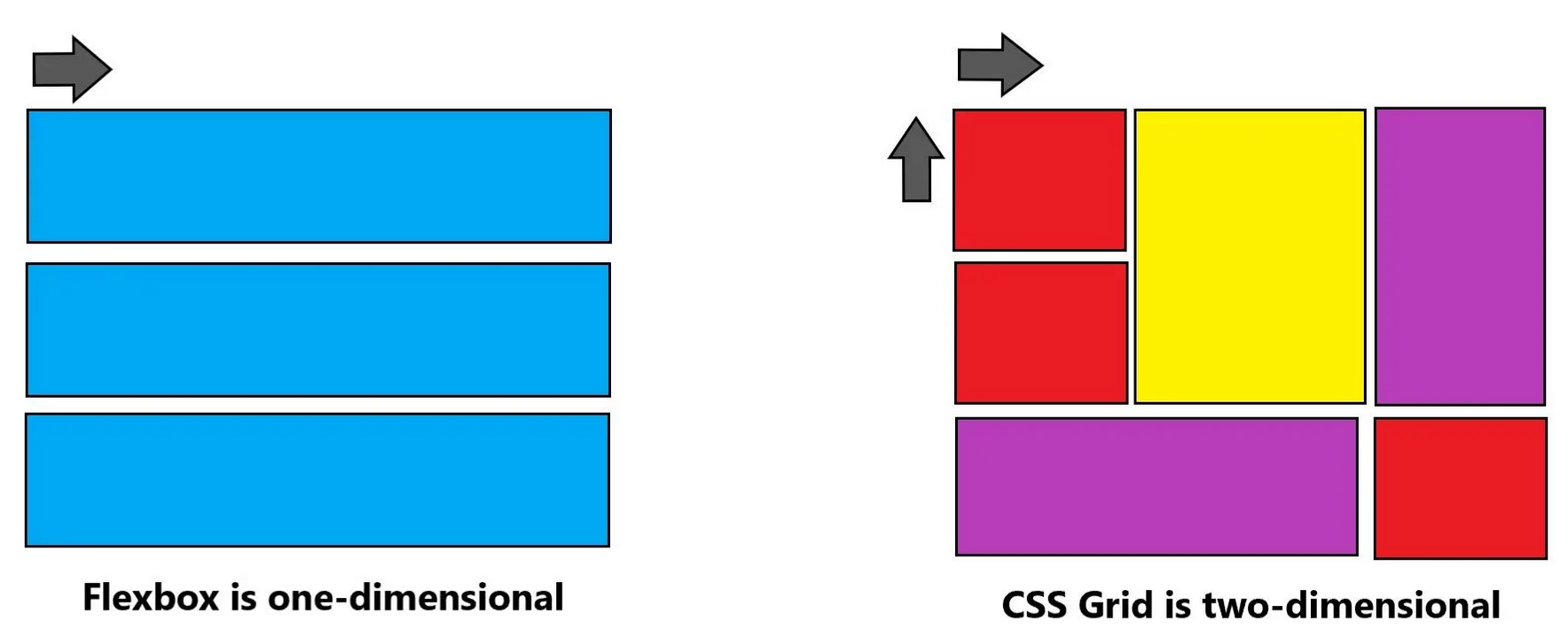
Grid vs Flex
Previously, CSS Flexbox was known to be used for a bunch of layout-related issues due to its natural flow, ordering capabilities and ability to align and justify content or containers with ease. It's main issue though is that Flexbox is a mainly a 1-dimensional system whilst Grid is a 2-dimensional system. The main difference here is the 2-dimensional Grid allows control for both columns and rows whilst allowing flexible widths on content blocks inside the grid.
Flexbox 'flows' its content and is mainly designed for EITHER a row or column. It is very well suited to smaller, dynamic layouts/blocks, such as the positioning of social media icons in a list or dynamically aligning content within a block to work well responsively.
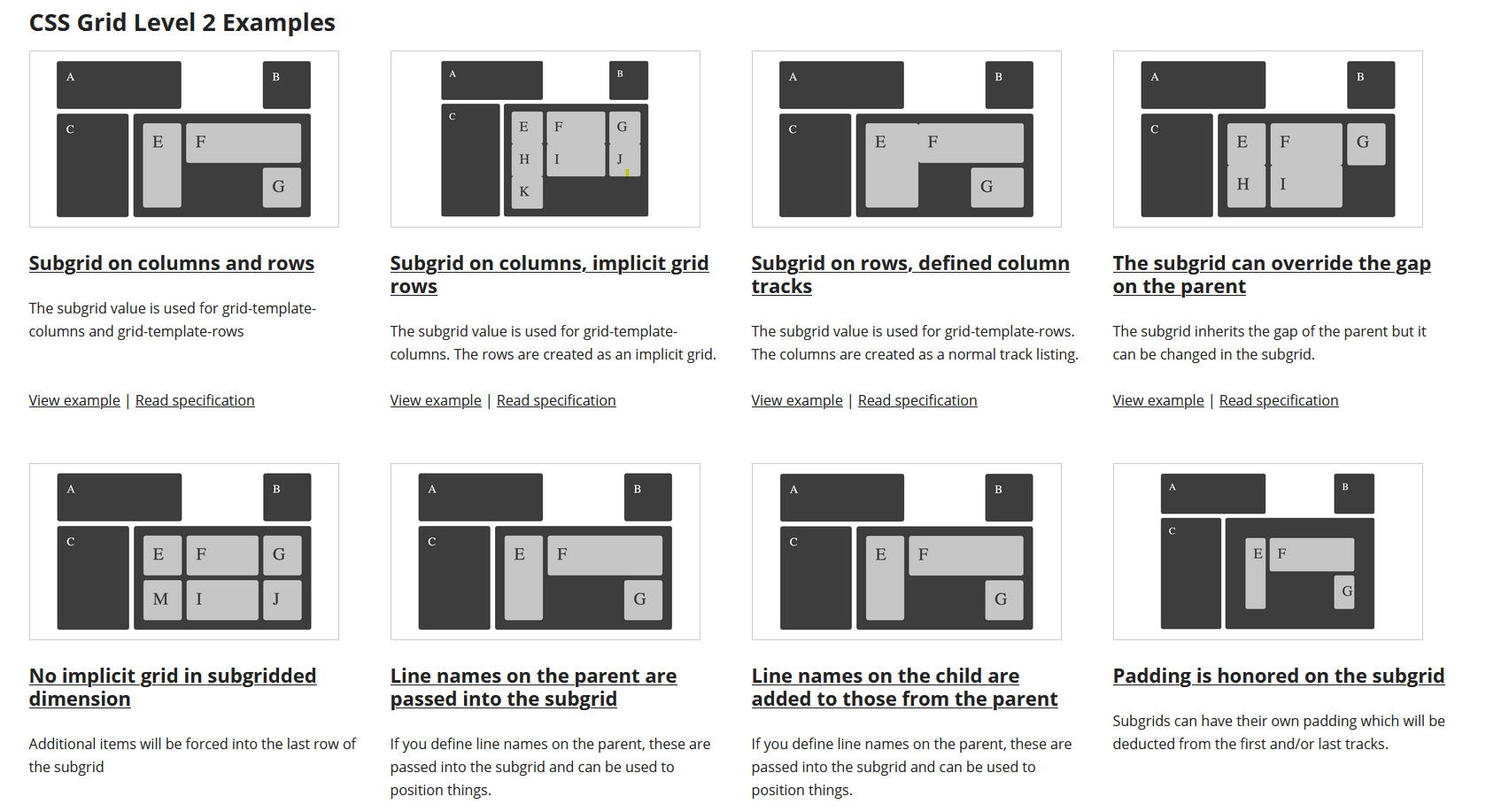
Subgrid and the future
CSS Grid is becoming the new standard for layouts and its many uses are being discovered more and more. Quite like an extension, Subgrid is being developed for the CSS Grid which aims to tackle issues around the Children Blocks within a grid. It allows more customization and fixes misalignment within grids for example. Miriam Suzanne has produced an excellent video showing how Subgrid can help tackle issues within grids.
Looking into Web Design trends, CSS Grid layouts score very highly at 2nd place, clearly symbolizing the importance and rising popularity.
Browser Support
Support for CSS Grid is quite high at 91.89%, but only contains partial support for old browsers such as IE 11. Subgrid, on the other hand, is highly unrecommended at the moment due to it only having support in Firefox 71-72. It is still a work in progress, but is highly likely to make its way to better support.
Examples of what can be done:
Grid By Example contains many interesting examples and code for existing layouts that can be built in CSS Grid, please take a moment to view some examples below:
Summary
Would it be worth learning and working with CSS Grid? Absolutely, yes and other developers agree. It's clear that it is becoming a rising trend with its potential capabilities and it offers so much in terms of layout design, customizability and structure. It is supported by all current major browsers, just with the exception of partial support on IE11. Please take a look at some examples, Olivia Ng creates many fantastic CSS Grid examples on her CodePen page, from ticket designs to full website pages.